

The last 250 years have definitively reshaped humanity. Through these chapters of conflict, triumph, and relentless innovation, watchmaking has mirrored each era’s architectural language, engineering prowess, and artistic tastes into its own creations. Right from Art Deco’s elegant geometrics and Bauhaus’ minimalist utilitarianism to the economic conservativeness of World Wars, watches truly are a reflection of the times. Today, as watchmaking leans hard on nostalgia and reinvents classics as future icons, we’re witnessing a resurgence of a unique architectural philosophy: Brutalism. Here’s a deep dive into this eccentric, post-war design language and the icons embracing it today.
Brutalist Architecture: What Does it Mean?

Rising from World War II’s ashes, Europe needed to repair and reconstruct itself quickly and cheaply. Scavenging leftover resources, civil architects were seeking efficient and affordable construction methods to rebuild war-torn cities. As a strong, durable, and inexpensive material, reinforced concrete proved to be the perfect material for tight-budgeted reconstruction projects. First used in government offices, schools, and social housing buildings, this style of stacked floors and unpainted concrete surfaces sparked an architectural revolution in Europe.
Brutalist architecture emphasized functionality, low-cost construction, sharp geometrics, and raw finishing. The term ‘brutalist’ was coined by British architectural historian Rayner Banham, taken from the French “béton brut”, meaning “raw concrete”. This architectural style was rapidly adopted across European countries, North America, Latin America, and most notably the Soviet Union.
Rebelling Against Convention: Brutalist Architecture in Watch Design
As brutalist architecture’s stern structures and grungy concrete works ventured into the ‘60s, the lines between watchmaking and architecture elegantly intertwined, and maisons developed their own interpretations of this sharply geometric design philosophy. Here’s an example of a Gérald Genta-designed Audemars Piguet featuring end-to-end lugs and obelisk-like hour markers in absolute brutalism. Another spectacle of early brutalist watchmaking is this circa-1970 Glashütte Spezimatic Bison interplaying squares, rectangles, and everything in between. One of our favorites, however, remains this Patek Philippe time-only featuring an ergonomically curved, rectangular yellow gold case.
As decades passed, new adaptations like neo-brutalist and eco-brutalist architecture emerged and continued influencing watchmaking. Here are a few recent examples of brutalist architecture in watchmaking that captured our attention.
Audemars Piguet [RE] Master 02

In 2024, AP’s [RE] Master 02 revived a brutalist movement in watchmaking. Unexpected, eccentric, and sharply geometric, the [RE] Master 02 (based on 1960’s Ref. 5159BA) was pulled out of AP’s hidden archives, featuring 30 asymmetrical models designed between 1959 and 1963. Relatively larger than its 1960 predecessor, it also swaps out its original yellow gold casing for sand gold, mimicking brutalism’s concrete surfaces. Featuring AP’s signature ‘Bleu Nuit Nuage 50’ dial, it boasts a linear satin finish and twelve silvery lines as hour indexes. The sapphire glass, which spills over the edge, was technically challenging to craft. Inside the 41-millimeter case rests the self-winding calibre 7129, which offers a 52-hour power reserve.
Richard Mille – RM 16-02 Automatic Extraflat
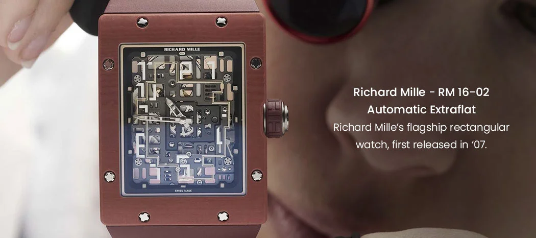
The RM-16 is Richard Mille’s flagship rectangular watch, first released in ‘07. Inspired by the original icon, Richard Mille unveiled two new versions in early 2025. Strikingly simplistic and perfectly right-angled, the new Extraflat models are cast in grade 5 titanium, and are terracotta-hued. With a distinctly urban identity, it boasts a fascinating skeletonized maze-like labyrinth running across the dial — complying with brutalist codes. This monolithic structure embodies the harmony of geometry and technical ergonomics, featuring the CRMA9 in-house movement with a total thickness of 9.50 millimeters.
Bvlgari Octo Finissimo

There’d be no better place to advertise this Gérald Genta-originating icon than a Soviet architectural magazine. Bvlgari’s eight-sided Octo Finissimo is a sharp interplay of cuts and curves — purely brutalist in our opinion. While the maison has no official comment on brutalism influencing the Octo’s design, Genta did pencil its original silhouette amidst the architectural style’s golden days. In its quintessential form, the Octo Finissimo is forged out of titanium, exuding brutalism’s signature hue of concrete surfaces. Combining this with the case and bracelet’s ‘layered’ design, it reminisces early brutalism’s signature practice of floors repeatedly stacked upon one another.
Toledano & Chan – B/1.2

It isn’t just the big leagues, microbrands have been embracing brutalist architecture’s sharp structures, too. Take Toledano & Chan’s 175-piece B/1.2, whose case is constructed out of 904L stainless steel. Furthermore, the case is inspired by an oddly brilliant and asymmetrical window of the Met Breuer building on Madison Avenue, New York (interestingly built during the brutalist age). Vibrantly contrasting the pale concrete hue, the lapis lazuli dial and left-side crown make it a piece unlike any other. It’s rebelliously geometric and concrete-cast — doesn’t get more brutalist than that.
Rado True Square Thinline Les Couleurs™ Le Corbusier

Two of brutalist architecture’s guiding principles are innovation and minimalism, laid out by Swiss-French architect and modernist Le Corbusier. Rado’s True Square Thinline Les Couleurs™ Le Corbusier commemorates this visionary’s influence and impact in architecture. As the “Master of Materials”, Rado has pioneered the use of ceramic as brutalism did with cement. While this model doesn’t boast any physical cues of brutalist architecture, it does so in essence. Le Corbusier is also remembered for his transcendent theory of color, ‘Architectural Polychromy’, and palette of 63 shades introduced in 1931. Rado celebrates his contributions with vibrant pastel yellow and neon blue ceramic accents along the bracelet and dial.
Piaget Polo 79

Brutalism was material made honest, and form made monumental. Piaget’s Polo 79 channels that same philosophy, but in gold instead of reinforced concrete. Introduced in 1979, it audaciously abandoned the idea of separating case, dial, and bracelet. Instead, it presented itself as a singular block of horological architecture: a seamless object of 18-carat gold where horizontal grooves run uninterrupted across every surface. This rhythm of repetition — dial, bezel, bracelet, all in unison — mirrors the stacked façades and linear symmetry of brutalist buildings.



Recent Posts
Recent Comments
Archives