Watches, other than being an instrument, are also the material manifestation of history, craftsmanship, heritage, and innovation of a brand. Renowned watch maisons worldwide have built their legacy through exceptional artistry, precision engineering, and iconic designs. A crucial element in establishing a brand’s identity is its logo, a mark that not only represents its values but also ensures a lasting presence in the world of horology. In this blog, we will explore some of the most well-known watch brand logos, their inspiration, their ideas, and facts about Swiss watch brand logos.
The Role of Logos in Watchmaking
In watchmaking, logos are powerful symbols encapsulating a brand’s philosophy, craftsmanship, and legacy. Maintaining consistent branding across generations is crucial; even subtle elements like typography play a significant role in a watch’s character and appeal. Such consistency ensures that logos remain instantly recognizable, fostering consumer trust and loyalty, as noted in the history of watch brand logos. Let’s delve more into these brand languages and learn about Swiss watch brand logos.
Iconic Watch Brand Logos and Their Meanings
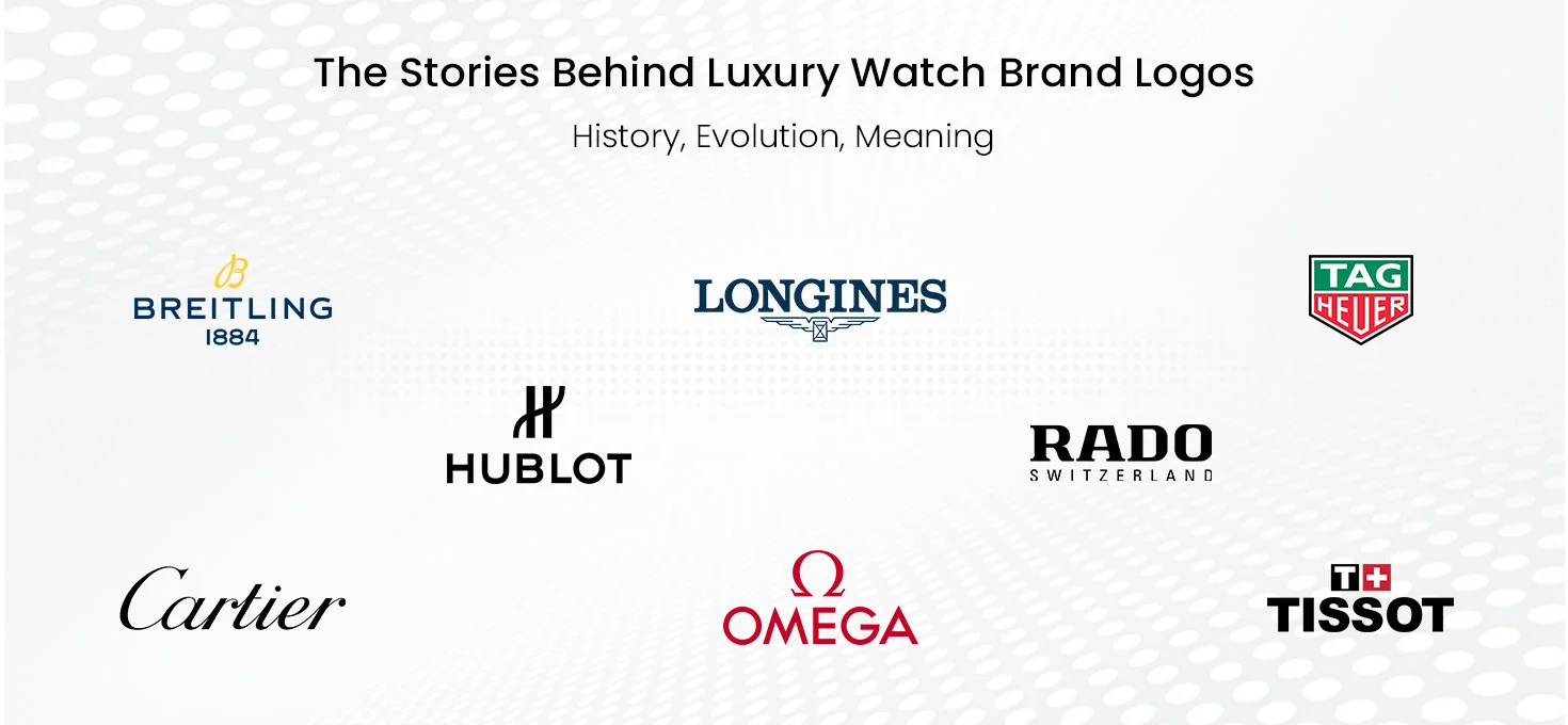
The history of watch brand logos showcases how iconic timepiece makers have refined their visual identity while maintaining a strong connection to their roots. Whether through subtle refinements or bold redesigns, these logos represent precision, luxury, and timeless appeal. Let’s look at some of the most well-known watch brand logos and their significance.
Omega: The Greek Symbol of Perfection
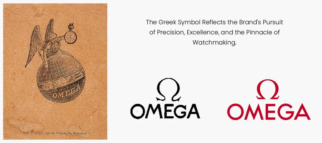
Omega’s logo, designed around a stylized Greek letter, embodies the ideals of perfection and accomplishment. The brand’s dedication to crafting precise and dependable timepieces is deeply reflected in this emblem.
History & Evolution
The imagery of a globe played a significant role in shaping the Omega logo as we recognize it today. Even before the company adopted the Omega name, the iconic symbol was already in use. In 1895 advertisements promoting its new in-house caliber, an illustration featured Chronos, the winged Greek God of Time, standing atop a globe marked with the Omega symbol, holding a lance and a pocket watch.
The Swiss luxury watchmaker’s emblem has remained largely unchanged for over a century, with only minor modifications to its color scheme.
The original design, used until 1974 on watch dials, packaging, and advertisements, displayed a slender, curved Omega symbol positioned above the brand name in matching color. The logo primarily used a sans-serif font, except for the “G,” which featured a sharp serif on its curved upper part, balancing the points of the Omega symbol.
The first significant redesign occurred in 1975, refining the original emblem by enlarging the wordmark and enhancing the clarity of all elements. The typeface became a clean, bold sans-serif, reinforcing strength and simplicity. Today, Omega’s official logo is primarily in red, though variations in black are also commonly used.
Longines: Remembering the Aviation Heritage
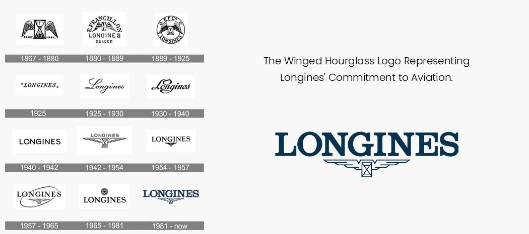
The Longines logo features an hourglass with two wings, under the brand name ‘LONGINES’. When we talk about Longines logo, we cannot miss the winged hourglass, a timeless emblem symbolizing precision, heritage, and innovation. The brand name is written in a classic serif font, exuding elegance, and tradition while maintaining a refined and recognizable aesthetic.
History and Evolution
Registered in 1889, it is one of the oldest unchanged trademarks in watchmaking history. The history of watch brand logos highlights how the winged hourglass represents Longines’ commitment to craftsmanship and aviation, reflecting its historical involvement in pioneering timekeeping for explorers and aviators. Since its registration in 1889, the logo of Swiss luxury watchmaker Longines has undergone more than ten revisions. However, one consistent element remains present in most versions—the winged hourglass. This iconic emblem not only represents the brand’s identity but also serves as a distinctive trademark that has safeguarded Longines from counterfeit products for over a century.
TAG Heuer: Bold & Vibrant Interpretation
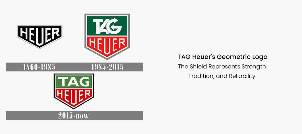
TAG Heuer’s shield emblem and bold typography reflect its precision, innovation, and sporty identity. The original monochrome crest, designed when Edouard Heuer founded the brand, featured a horizontal layout with “Heuer” in capitals, symbolizing strength and modernity. The current TAG Heuer logo, redesigned in 2015, features a subtle modernization of the crest’s shape, making it slightly wider. The “TAG” lettering was updated to a bold, extended sans-serif typeface. Additionally, the outline color was changed to a combination of white and black, enhancing the emblem’s sophistication and timeless appeal.
History and Evolution
TAG Heuer boasts a rich history, yet its visual identity has remained largely consistent, undergoing only two significant redesigns. Despite these changes, the logo has retained the geometric structure and bold presence of the original emblem. Its design is rooted in masculinity and confidence, making it both distinctive and memorable.
The first TAG Heuer emblem, introduced in 1860, featured a sleek and bold monochrome crest with a horizontally elongated shape and a downward-pointing triangular peak. The black background was contrasted by a thick white border, while the brand name “Heuer” was displayed in uppercase letters inside the crest, following its contours for a balanced and striking design.
After TAG’s acquisition in 1985, the crest was stretched vertically to incorporate “TAG” above “Heuer.” The 2015 update refined the crest, using a modern sans-serif font and a black-and-white color scheme for a sleek, timeless look. The brand name appears below, with “TAG” in bold uppercase and “Heuer” in the title case.
Cartier: The Elegant Signature
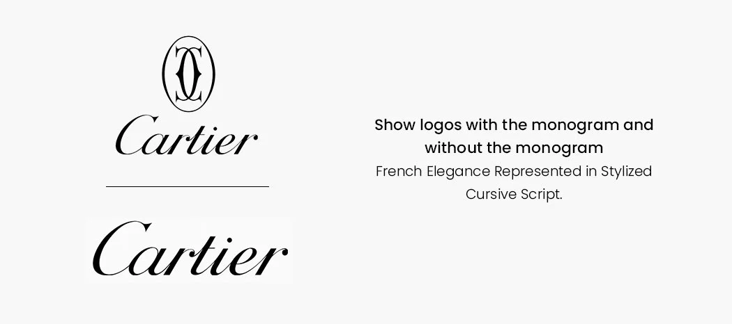
Cartier’s logo, featuring two elegantly interlaced letter C’s, symbolizes the brand’s rich heritage in crafting exquisite jewelry and timepieces for royalty and aristocracy. It embodies luxury, sophistication, and timeless elegance – the characteristics that can’t be missed while talking about Cartier logo.
History and Evolution
The logo has evolved subtly over time while maintaining its essence. Initially, it featured the Cartier name in a classic serif font, later transforming into the intertwined “C” emblem that signifies refinement and prestige. Typically, the logotype appears in black on a white background, with an oval emblem above it. Occasionally, a gold and burgundy color scheme is used, enhancing its regal and sophisticated appeal. The evolution of Cartier’s logo reflects its journey from a renowned jeweler to an iconic luxury watchmaker.
Breitling: Clean Lines & Simple Layout
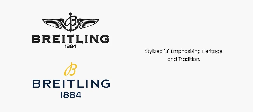
The Breitling logo features a golden-yellow stylized “B” monogram, symbolizing heritage and refinement.
The bold, navy blue “BREITLING” wordmark in a clean sans-serif typeface exudes reliability and sophistication. The year “1884” is displayed beneath, highlighting the brand’s rich history in precision watchmaking. The design embodies Breitling’s legacy of luxury, innovation, and aeronautical excellence.
Founded in 1884 in Saint-Imier, Bernese Jura, Breitling’s history of watch brand logos has undergone several transformations over the years. The emblem has seen changes in its symbol, typeface, and color scheme, reflecting the brand’s evolution while maintaining its core identity.
The current saying about Breitling logo goes that the brand returns to its roots, drawing inspiration from an earlier version rather than the more recent winged anchor symbol. While some fans miss the previous design, this refined logo emphasizes heritage, precision, and innovation, reinforcing Breitling’s legacy as a pioneer in aviation and chronograph timepieces.
Tissot: A Timeless Emblem of Swiss Precision
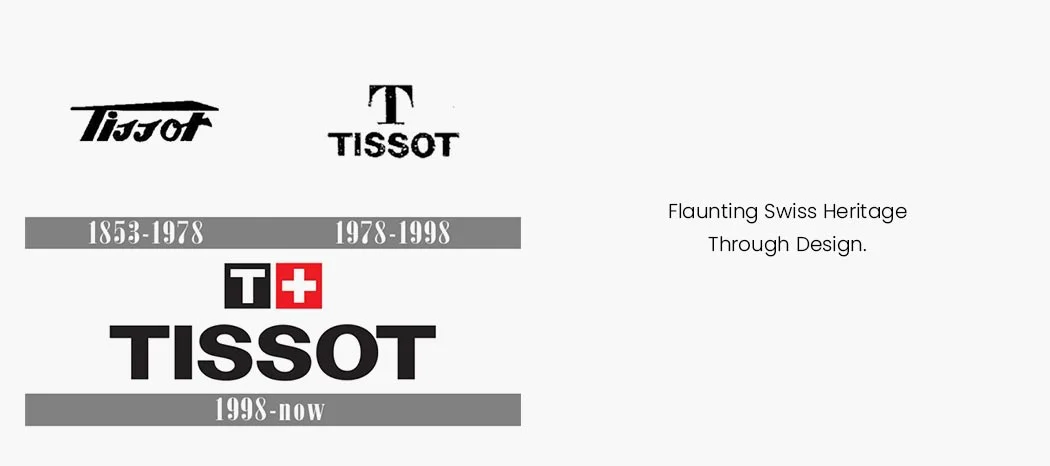
The Tissot logo symbolizes tradition, quality, and precision, reflecting the brand’s Swiss heritage and reputation for reliability. Its bold, clean design conveys stability and prestige, reinforcing consumer trust built over decades of excellence. Let us talk about Swiss watch brand logos and their evolution over the years.
History and Evolution
Founded in 1853 by Charles-Félicien Tissot and his son, Tissot’s logo has evolved alongside its watch models rather than changing by year. Early versions featured a handwritten-style script with a sweeping “T”, later transitioning to a square emblem housing a “T” above the brand name.
With the 1978 logo ‘T’ became a defining element of Tissot’s identity, featuring bold sans-serif lettering with an uppercase, well-balanced design. Above the brand name sat a serif “T” with elongated horizontal tails. As Tissot expanded globally, the word “Swiss” was initially included in the logo. In its current version, the brand name is paired with the Swiss cross in a red square, a symbol of Swiss heritage, precision, and craftsmanship, making the logo instantly recognizable worldwide.
Rado: Monochromatic & Modernized Inspiration
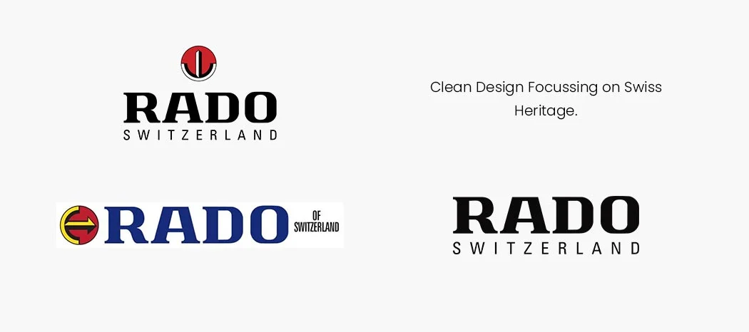
The word Rado means ‘wheel’ in Esperanto. The present logo features the brand name Rado with simple, clean lines and minimalist design.
History and Evolution
Rado, originally a part of Schlup & Co. in the 1950s, introduced its watches with a distinctive emblem and wordmark. The original logo featured a horizontal half-ring with an arrow emerging from its center, resembling a stylized “E” with an arrow replacing its middle bar—symbolizing a watch face with hands.
In 1988, the emblem was redesigned with a vertical arrow, a simplified triangular tip, and additional elements like a white stripe and red circle. The typography evolved to a taller, lighter style, and the word “Switzerland” was added.
By 2003, the arrow emblem was removed, leaving only the brand name in its refined, bold typeface. Today, the minimalist Rado logo reflects the brand’s commitment to modern design, innovation, and Swiss craftsmanship. This evolution tells a compelling story about Rado logo and its dedication to timeless elegance.
In conclusion, exploring the history, meaning, and evolution of iconic Swiss watch brand logos reveals the deep craftsmanship, legacy, and prestige behind these timepieces. For enthusiasts and collectors alike, learning about Swiss watch brand logos offers a fascinating glimpse into the world of luxury watchmaking.
Hublot: The Minimalist Mantra
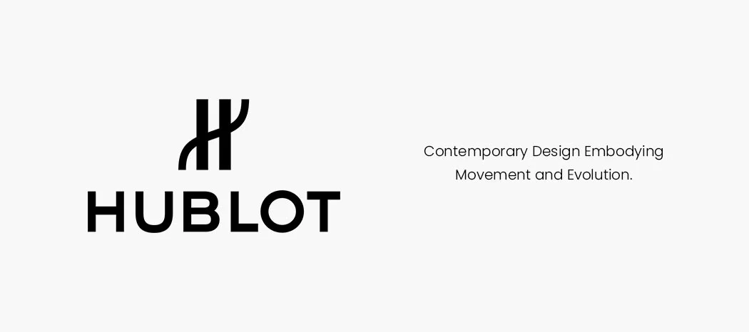
The central element of Hublot’s logo is a stylized “H”, composed of two parallel vertical lines. Instead of a traditional horizontal bar, a curved line intersects them, extending beyond the vertical lines on both sides. This unique design adds a sense of movement and modernity, distinguishing it from a standard “H”. The typography of the Hublot name is clean and minimalistic, reinforcing its sleek, contemporary aesthetic- a feature to mention when we talk about Hublot logo
History and Evolution
Hublot’s origins date back to 1976 when Italian entrepreneur Carlo Crocco departed from the Binda Group to create his own watch company. The brand was officially founded in 1980, deriving its name from the French word for “porthole”, meaning a round window in a ship or aircraft. Over the years, the logo has remained largely consistent, maintaining its bold, modern appeal while complementing the brand’s commitment to fusing traditional craftsmanship with contemporary innovation.
KAPOOR WATCH COMPANY:
Kapoor Watch Company is a premier Indian luxury retailer, offering an exquisite selection of timepieces, fine jewelry, and accessories from some of the world’s most renowned brands. With a carefully curated catalog, we bring Cartier, Bvlgari, Chopard, Breitling, Montblanc, and many other prestigious brands mentioned in the blog. Whether it’s an iconic timepiece or an elegant statement piece, Kapoor Watch Company continues to set the standard in luxury retail, making haute horology and fine craftsmanship accessible to connoisseurs across the country. Visit Kapoor Watch Co. website OR Visit Kapoor Watch Co. Stores to check out our collection.


Recent Posts
Recent Comments
Archives