

If there is one thing that riles up a watch collector (of any level), it is when something appears to be copied. This can be across models, brands, price ranges or even just an attempt-at-homage piece. If the serious (Spartan) horophile gets even the slightest reek of the possibility of a design element that is replicated or even loosely borrowed from an existing watch, they will not hold back their punches.
But design often follows fashion. And fashion, largely speaking, is art. Like other art forms, they are all shaped by influences. The exposure that inspires an artist can come from any field or dimension. And their understanding of these elements can take on various forms. Between these two, influences and interpretations, the permutations can be infinite.
But that’s just the artist. We, as viewers of said art, have our own set of influences and interpretations. Consequently, how an artist intended it versus how we, the viewer, perceive it, can again be an entirely different syllabus for a whole new course. With so much subjectivity at play, it is quite possible that when we see one thing, it immediately reminds us of something from our past, which may or may not have been intended by the executor. Either way, we can debate art till the cows come home, and yet, someone somewhere will be swooning endlessly over a piece of metal or a line on a canvas that to us feels nothing more special than the doodling of a sugar-happy toddler.
Watch Design
So where do watches figure in all this? Well, if one thinks of watches as purely a tool, a functional piece of equipment to keep and tell time, then the only design one needs to plan for is legibility. What’s that you say – accuracy? -No, science would be taking care of that.
Design has a definite play where watches are concerned. It is one big reason why they all look so different, why we covet so many, and why we secretly keep saving up for the next grail while handling daily domestic duties.
But, as happens with all design, it has inspiration somewhere. Sometimes the connection is short and apparent, and at other times, it goes through a few stages of adaptation before being finally assimilated into the object at hand. In either case, design is much like a rumour, it keeps going around, changing with every transmission, and most times, nobody really knows who started it.
Let’s look at a few design elements in the watch industry which are so prevalently and persistently present, we just accept them as the industry standard. In many cases, these elements are so strongly associated with a brand (or brands), we simply assume that it was their invention (when it wasn’t) or something that is unique to them (even when it isn’t).
Cathedral Hands
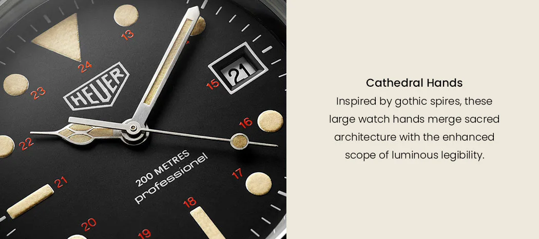
The spires of a cathedral can be an imposing architectural element, one that was designed to be seen from a distance, to summon people from near and far at prayer time. It was also a sign for weary travelers to guide them to a place of rest and safety. Most such gothic churches came around at a time when religion was trying to educate people about heavens above and the path to getting there. Their architectural flourish was a flamboyant display of the power and prestige of not just the church but also the ruler of the times. They weren’t baroque but they took the idea of height to new levels, literally. Usage of flying buttresses meant that walls were merely a frame to hold lovely stained-glass windows.
These elements that, probably in the mind (and hands) of a religious watch designer, precipitated down to watch design. Possibly someone trying to retain a sense of the importance of churches, or a reminder of the omnipresence of God, shrunk the general form of the windows and arches into the hour hand of watches. Would have definitely looked holy when it must have debuted. A lovely interpretation to capture the likeness of God’s home in a size that you can tow around at the end of your arm.
So how come it stuck around? Why didn’t it die out, as most fashion does? Well, these large hands were incredibly easy to apply luminous paint on and, this made them a whole lot more meaningful to the military. They saw a design advantage that was unique, essential and unbeatable by everything else so far. Consequently, it stuck around, albeit with a new set of believers.
Sector Dials

If you ever did titration experiments back in school, you will remember just how precise one had to be while taking down measurement numbers. Here’s a little fact, for the recent Artemis mission, to calculate the trajectory of the spaceship around the moon, scientists had to work with the value of pi up to 30 decimal places, purely for reasons of accuracy. When such precision is needed, scales and instruments are graded to much tinier factions, in order to help us note down readings more accurately. The smaller sectors and subsectors almost snake around, or up and down, depending on the shape of the instrument or vessel.
Watches also work around the idea of precision but not as strongly as say, space travel. But even then, for something that is used to measure, having a scale with sectors marked out is more so a logical extension than a genius idea. So, when a watchmaker decided to use demarcations along the inner circumference of the dial to simply divide the hours, minutes and seconds, one can’t even be too sure if they were actually inspired by gauges and scales or were simply applying a basic tenet of physics to yet another scientific invention.
You know how to tell when something is a good idea? It feels so intuitive that people wonder why did it take so long to come around? It’s one of those, “Why, even I could have done that!” thought-rousing moves. Sector dials were so simple and practical and further upped their relevance with an unmatched aesthetic addition, that they have stuck around like glitter on your face two days after you went to the parade!
Pilot or Flieger Dials

Another instrument cluster inspired idea to seep into watch territory involves the large oversized font in bold used to display the numerals, with everything from the hands to the markers displaying an exaggerated sense of proportions.
If you have even sat in the cockpit of a plane, you will notice that the dials are marked out in the boldest and most legible of manners in high contrast with anti-reflective coatings and equipped to be read in low light, all to increase efficiency for pilots so that they can read them even at a quick glance under all conditions. Such dials leave no room for ambiguity, and rightly so; I’d hate for someone navigating my plane or boat to misread anything by even the slimmest of margins.
That same functional aesthetic made its way into watches, first offered to the same people who were interacting with these very dials – pilots, ship captains, divers, and navigators. Today this spillover continues to draw a devoted fan following – people who love their pilot watches – even if they will never sit in a cockpit or commandeer an armada. As for me, with advancing years, as I feel that slight squint when trying to read things too close or too far, I feel I may be ripe for picking out a pilot watch sometime soon.
Tachymeter Scale/ Perforated Straps
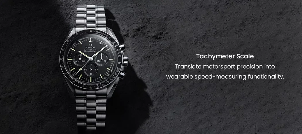
We have so far covered architecture, industrial gauges, and things that move on sea and in the air. But what about on land? Terra Firma should have us grounded too, pun deeply intended. Well, we have the motorsport industry which has given us quite a few “loan ideas” that the watch industry has conveniently held onto steadfastly.
The first of these is the tachymeter bezels. Tachymeters are used to gauge the speed of a moving object by measuring the time it takes to cover a fixed distance. The gradation is built into the scale so that as we measure the time (ideally with a chronograph) and when we stop the watch, we have the hand marking the time but also telling us the speed at which the object was travelling. It’s quite handy on a track where cars are doing laps. Well, that feature is what was combined with (chronograph) watches and some of the most popular motorsport inspired watches today bear testimony to this crossover.
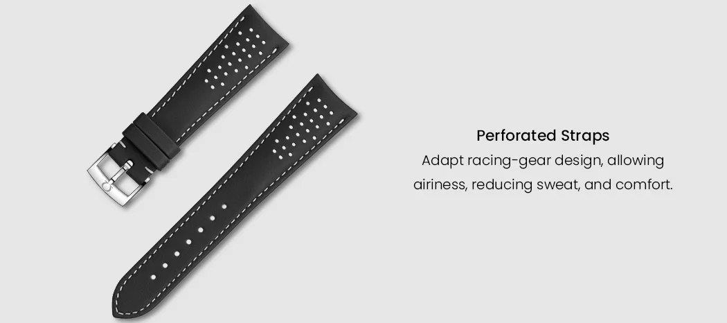
Not just that, another thing was inspired from the car-racing field was perforated straps, a way to make them breathe and not accumulate sweat, and consequently, stink. It’s the same principle as used in leather driving gloves of yore – perforations for airiness. Next time you see a leather strap with perforations or even a steel one with gaps, you now know how it came to be.
Gem Setting
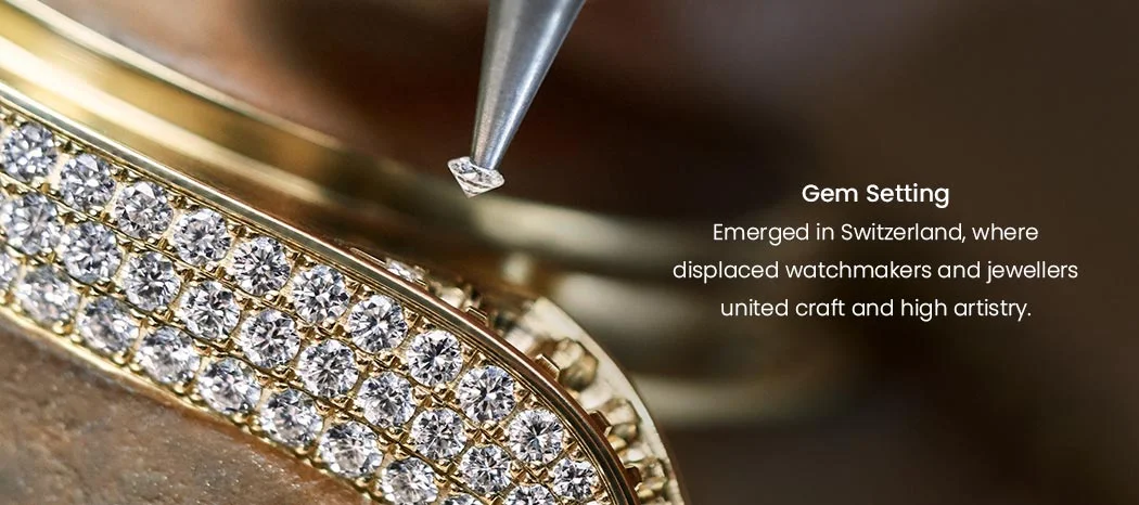
This is another one of those “logical when seen through the lens of history” facts. To shorten the saga, when the protestants were evicted from France, many of them somehow converged in the mountains of Switzerland which was undergoing its own religious upheaval. The Calvinists were preaching a life of simplicity and anything glitzy or precious was considered a vulgar and ostentatious display of wealth. This made jewellery fall out of favour with the wealthy. So, we had evicted watch experts and jewellers, all out of a job and somehow living in close proximity. Over time, as norms relaxed, the jewellers and the watchmakers came together to combine their craft and the high artistry was introduced into the world of watchmaking.
Now, to be fair, this wasn’t the first time jewellery was being fashioned into time pieces (or vice versa); kings and queens had had their share of such lavish splurges. But to be made available for the masses is what happened from the confluence mentioned above.
Conclusion
Nothing is original; it is inspirations and imaginations all the way down, or up, no matter which direction you look. Don’t get too caught up trying to find the ‘original’ – instead focus on the one that speaks to your heart. Laud the collective efforts that took centuries to culminate into what we enjoy and experience today and be glad that we live in times when all this is available to us so easily (except allocation watches) and so freely (never mind the seven-figure price tags).


Recent Posts
Recent Comments
Archives